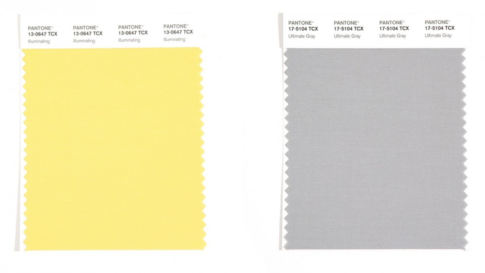
Pantone’s Color of the Year Is Really Weird—Just Like Everything Else Right Now
Today, Pantone released their official Color of the Year for 2021. Or I should say colors of the year, because the branding company chose to highlight two very different hues: Illuminating, a bright (but not fluorescent) yellow, and Ultimate Gray, which appears to be the exact same color as my web browser. As usual, Pantone’s choice strikes me as rather tonedeaf and halfhearted, gesturing clumsily towards current events without taking any identifiable political stance. According to the company, these colors aren’t meant to stand alone, they must be presented together. They’re “two independent colors that highlight how different elements come together to support one another.. practical and rock solid but at the same time warming and optimistic, the union of PANTONE 17-5104 Ultimate Gray + PANTONE 13-0647 Illuminating is one of strength and positivity.”
This anodyne statement is reminiscent of both their 2018 pick, Ultra Violet, which was “about” bridging partisan gaps and their 2019 pick, Living Coral, which was supposedly about saving our ocean reefs from destruction through… buying more coral-hued stuff, I guess. It was never clear what the color (which was reminiscent of 2008 Jenna Lyons-era J.Crew silks) had to do with the oceans. And perhaps that’s the biggest reason I dislike this choice. It feels wishy-washy and vague. Pantone has such a great global reach, I wish they’d either stop trying to hitch their color trends to current events, or pick something more meaningful. Medical Mask Blue, for instance, as a reminder that we’re not through this crisis yet and we still need to be masking up. Or Ultimate Gray, as a reminder that the future is always a vast unknown space, no matter how much we project our desires onto it.
But the other reason I dislike Ultimate Gray and Illuminating is because of how they’re paired. Pantone has never chosen gray as a color of the year before, and it would have been a ballsy choice to just throw their hands up and say, yeah, things kind of suck right now, here’s your color. Instead, they paired the flat neutral gray with a true primary yellow (a color associated with madness, illness, and domestic horror).
It’s been a few years since the now-defunct fashion blog Man Repeller observed that something called “Gen Z Yellow” was on the rise, and I can’t help but think this decision is drawing on the popularity of turn-of-the-millennium aesthetics among the younger generations. As a millennial, I remember the late ’90s and early 2000s very clearly. This was a time when gray (with a “pop of color!”) dominated all interior design trends. Sitcom-inspired normcore fashion was the order of the day, though it wouldn’t get that name until much later. In fact, to me this color pairing feels downright “Frasurbane,” to use a term coined by designer and researcher Evan Collins. According to Collins, Frasurbane is an aesthetic popularized in the ’90s that was an “understated” and Baby Boomer-friendly version of the more radical looks of the youth. It was, he writes, “compatible with both the zeitgeist of an aging population… and the surface environmentalism of the era.” Scrolling through his collection of images, you see lots of light yellow, lots of neutral grays and browns, lots of comfortingly bland interiors and curly end tables. It’s the aesthetic of a therapist’s office or a ’90s coffee shop. It’s the corporate-friendly version of 90s grunge and environmentalism which is, actually, pretty fitting for this moment. Maybe Pantone nailed it after all.