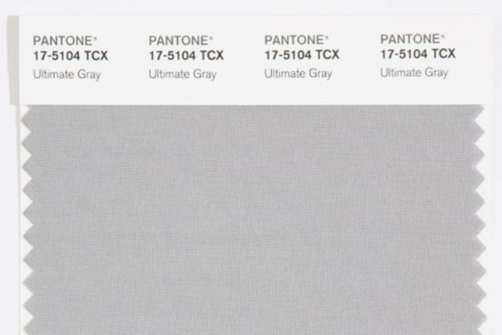
Pantone has revealed its 2021 colour, and it’s depressing AF
It’s grey, of course it’s grey
Each year the Pantone Colour Institute, the colour matching company used by graphic designers, fashion houses, and more, releases its colour of the year. Intended to echo the mood of the moment and realise it in colour form, the colour for 2021 has been chosen – and tbh, it’s pretty depressing. But then, what else would you expect from this deeply depressing year?
With colours such as Rose Quartz 13-1520, i.e. millennial pink, Radiant Orchid 18-3224, and Ultra Violet 18-3838, being chosen as previous colours of the year, this year we got (drum roll please) … grey! Ultimate Grey 17-1504 to be exact.
Grey, everyone’s favourite colour; the colour of the sky when the weather is shit, the colour representative of depression, and the colour of terrible suits. But Pantone seemingly had different thoughts when choosing this colour.
“Ultimate Grey is about strength and resilience,” Leatrice Eiseman, executive director of the Pantone Colour Institute, told Vogue. “If we think of it in terms of nature, it’s the colour of pebbles at the beach, of rock and stone that have been around for millions of years and aren’t going to disappear anytime soon.” Considering this has been the longest year to ever exist, grey really does seem to fit the bill.
The team also pointed to the grey tracksuits we’ve definitely all been wearing throughout the year as reasoning for their choice – “We’re not going to spend the rest of our lives in them, but the point is that we’ve learned to be OK with them and what they say about our lifestyles in 2020.”
But it’s not all doom and gloom. Taking into consideration how unprecedented this year has been, the colour forecasting team has done the unprecedented thing of selecting two colours for 2021, and the other is definitely more optimistic.
Alongside Ultimate Grey, the team have also chosen ‘Illuminating’ yellow, a colour you might recognise from Prada’s SS21 runway carpet. Representing sunshine and a break in the clouds, the hue seems to point towards a better, brighter future – something we’re holding out for at the moment.
And, while grey and yellow may seem like an odd pairing, the colours have featured together for the likes of Off-White at its AW19 showing and Balmain for its SS21 presentation.
Revisit Prada’s SS21 show in the gallery above.

